|
|
| Welcome to 3T! Please take the time to register and join in on the friendly,knowledgeable watch talk.Please note that not all registrations will receive an immediate activation e-mail.Those who do not receive an immediate notification will be activated manually within 48hrs. by an admin. without an e-mail activation url sent to you,you may then sign in using your username and password,if you feel there is a problem please e-mail us at timetechtalk@hotmail.com and include your name and username and we activate your account.Thank You! |
| Moderated by: 3T | ||
| Author | Post | |||||||||
|---|---|---|---|---|---|---|---|---|---|---|
|
BENARUS 3T WIS 
|
We have had some discussion about an extra Moray dial in green and maybe a logo. If I will make it it will be an special forum Moray and the logo will be only on this Moray. And that also means dial #2 will be 50 instead of 100 pcs. I will start a poll to hear your opinions.  |
|||||||||
|
maroon03 3T WIS
|
personally i think that if you are going to do this dial it needs to be as simple as the rest of your watches that is the biggest reason that people are drawn to them in the first place and lets remember this is supposed to have that vintage diver look to it not some crazy new design. I do think that for this moray it should have that vibrant green like the fish which is alot like the green of 3t. just my opinion :) less is more. Last edited on Tue Mar 10th, 2009 10:51 am by maroon03 |
|||||||||
|
Rhino-Ranch Guest
|
Ralf, I am probably personally responsible for suggesting the EEL logo... so, I continue to believe that a logo much like what MORESNOWDAYS has been working on would look outstanding, and truly bring a level of refinement that would set the watch above and beyond the mass produced stuff out there. You already have 5 dials that have no logo, so it really makes no sense for anyone to complain or object to a possible no. 6 dial that has the logo. No 1 dial is very simple and almost sterile. So, I don't understand why anyone would object to the logo. The darker green that you've posted would be preferred instead of bright lime green. MORAY EELS come in many shades of green and brown, and a darker moody green would be more eerie than brite lime or Kawasaki racing green. My last suggestion was for the eel to be drawn length way above "500 Meters" . The eel could be drawn in silver, white, or lume. Finally, a deeply etched MORAY EEL head or full body wrapping around the case back would be outstanding. To those critics who do not like the logo, please consider that there are many, many well known logos, and many, many highly collectible watches have a distinctive logo. No 1 dial achieves "less is more." But please don't stand in the way of letting the rest of us have something special. That is my opinion and those are my suggestions. Hopefully, this poll will produce some desireable results, and of course, I understand Ralf that you've got to be confident that there is support for the concept. Thank you all, Jim |
|||||||||
|
maroon03 3T WIS
|
first of all i am not trying to stand in the way of anything i was just stating my opinion just as you were so lighten up. it is very hard to get a good pic of an eel on a watch face, now i do agree that if you do put one on there it should be a full pic not just the head and in a light contrasting color lume would work very well. and as i do understand that eels do come in many different shades most peoples first response when you ask them what color a moray eel is it will be bright green. i am a cetified master diver and have seen many morays and i can say that i have seen many more bright green ones than i have any of the other colors. im sorry that i ruffled your feathers but i am just a fan of the simple design. thanks klayton |
|||||||||
|
Michael 808 3T WIS 
|
The only little "speed bump" in this would be for the people that reserved a #2 dial with numbers above 50. Like me. Not a big deal though... Last edited on Tue Mar 10th, 2009 04:51 pm by Michael 808 |
|||||||||
|
Rhino-Ranch Guest
|
Seems like there is some interest in a dark green dial, with eel logo on back. I am hoping that our friend "Moresnowdays" will weigh in and provide some further graphics such as EEL stretched out just above 500 meters. |
|||||||||
|
moresnowdays 3T WIS
|
Is this what you had in mind? Sorry it takes awhile to find time to do alot this week, much going on. I also think the logo on the caseback is a neat idea. Would anyone like me to post it on the previous thread as well? Maybe I will so the ideas are all in one place? I should also note a couple of things. I like the dark green (British Racing) color my self, but it's not exactly the same shade in all my renditions so far. Slightly off because I am eyeballing the color with a tool in photoshop. Also, on this latest version the full body got strecthed a bit and I also slightly shrank the "500m" text as well. Attachment: Moray_3_10_09.jpg (Downloaded 219 times) Last edited on Tue Mar 10th, 2009 10:06 pm by moresnowdays |
|||||||||
|
Steve Laughlin 3T WIS 
|
"You already have 5 dials that have no logo, so it really makes no sense for anyone to complain or object to a possible no. 6 dial that has the logo." --- This 6th dial would be part of the family and the logo is out of character, I believe it is not refined or at the quality it should be for production, and having images on the dial in my opinion makes the watch look more like a "Freestyle" brand. I am not wanting to offend, but as a graphic designer, I feel strongly that this image is not developed enough for any type of production, I have made a lot of logos for companies and brands, and this is not the type of file you would use for printing, especially at the small size requirements of a watch dial. The logo needs to be created in a vector line based program such as Adobe Illustrator. just to back up what I am saying, here are some of the logos I have created in the past.  |
|||||||||
|
oagaspar Site Founder 
|
very cool Steve!...one of those silhouette design logos like the Raven may work with the eel hand6.gif |
|||||||||
|
moresnowdays 3T WIS
|
While I have been creating some renditions of the watch with logo on it, it has been for simply fun and to aid in the discussion of what some may be interested in trying. I'm not offeneded by your post at all, and have stated from the beginning that a logo on the dial of this particular watch may not be in the best interest of preserving the character of the watch. In my opinion, I think the best idea so far is a special edition in the dark green, with the logo on the case back. I also hope everyone understands that the logos that I have posted are in no way intended to be directly used as the actual logo. They are very rough renditions, not up to any kind of quality that is actually useable. They are only posted to illustrate the ideas of various members here and aid in discussion. I have done design work for a number of years and put a good deal of effort into my work. If a logo was firmly chosen, and Ralf wanted me to, I would be happy to create a more finished version of a logo. Although I'm sure he could do it as well. Until anything got to that point I wouldn't consider it worth while to go beyond these rough sketches simply for the sake of discussion. With that being said, I see some feel the same as myself in that logo should be reserved possibly for the case back if at all. However, I have been happy to create a few versions hopefully close to what others have stated they invision. It's great to hear others like what they see. Hope it helps in anyway. |
|||||||||
|
Rhino-Ranch Guest
|
Steve -- How about lending a hand ... as an accomplished graphic / web designer ... please give it your best... EEL. I don't have the expertise, but I have a good eye for detail, and my opinion is that the latest design from MoreSnowDays is very, very good. If you can do better, then please help us out. Jim |
|||||||||
|
Rhino-Ranch Guest
|
I would thicken the lines of the eel just a bit to give it some more presence...or just fill it in... but this is close, really close to perfect ! Jim |
|||||||||
|
Rhino-Ranch Guest
|
moresnowdays wrote: YES THIS IS EXACTLY WHAT I HAD IN MIND... I apologize for not quoting your post in my previous message... thanks again for all your work...on this creative collaboration. Jim Is this what you had in mind? Sorry it takes awhile to find time to do alot this week, much going on. I also think the logo on the caseback is a neat idea. Would anyone like me to post it on the previous thread as well? Maybe I will so the ideas are all in one place? |
|||||||||
|
Steve Laughlin 3T WIS
|
I accept your offer and will make a design for the case back tomorrow and post sometime tomorrow. just for the sake of another design idea. I am not opposed to having it on the case back as I have done them in the past for others, but I happen to like the Benarus caseback the way it is, I think it is first class. but I will create a Moray design tomorrow just for the Moray fans to see and give feedback. Steve |
|||||||||
|
Rhino-Ranch Guest
|
Steve, Thank you so much for lending your creativity and expertise. For myself, and other Moray fans -- I look forward to seeing your design! Jimwoohoo.gif |
|||||||||
|
Steve Laughlin 3T WIS
|
Good morning Moray fans! The Case Back - Here is my design, and let me preface by saying that I stand by the concept of "Less is More", I also like the saying "Just because you CAN, doesn't mean you SHOULD". That means that I am not suggesting we add a Moray logo to the caseback, I am only answering a challenge to back up what I was talking about and submit my own design. The Green Dial - The dark green dial color is okay as a dial, I think it could be studied longer to pick a more unique shade of green, but it really has nothing to do with an eel color, if you search "Moray eel" in google and click "Images" you will see some light green eels, but mostly brown, white, spotted, giraffe colors, dark blue, grey. Anyway, here is my caseback drawing. Below that you can see my rough drawing and vector line work, so that you know my work is genuine and I didn't just pull the image off the internet. Enjoy! Your feedback is always welcome. Steve   |
|||||||||
|
Rhino-Ranch Guest
|
HOLY MOTHER OF MORAY EELS BAT MAN !!! That ROCKS !!! Let's see if Ralf can gear up for this. Polish the highlights, like the ORSA Monstrum, and that would really show the depth of your work. COOL.... thanks Steve.  Jim Jim |
|||||||||
|
Steve Laughlin 3T WIS
|
Thanks Jim! |
|||||||||
|
slinky469 3T WIS 
|
Steve Laughlin wrote: Good morning Moray fans! I agree with you Steve, If it aint broke dont fix it, but that Moray logo on the case back looks awesome  great job on it great job on it |
|||||||||
|
Nabco 3T WIS 
|
Come on guys...your killing me  , I voted for the dark green with eel on the back and that seems to be winning.....I would rather not have to order another Moray, but if that combo wins my hand is forced and another will be on the way , I voted for the dark green with eel on the back and that seems to be winning.....I would rather not have to order another Moray, but if that combo wins my hand is forced and another will be on the way  BTW, Steve the drawing ROCKS...would love that design on the back of the case!!!! |
|||||||||
|
moresnowdays 3T WIS
|
Very nice Steve! I like keeping the logo on the back if one is to be used at all. Any chance you can do a full body version of the Eel on the back? I don't have software to make it look right like yours. Last edited on Wed Mar 11th, 2009 07:13 pm by moresnowdays |
|||||||||
|
BENARUS 3T WIS
|
hand6.gifhand6.gifhand6.gifhand6.gifhand6.gifhand6.gifhand6.gifhand6.gif I think we don't need the poll any longer |
|||||||||
|
Michael 808 3T WIS
|
Well Crap! Looks like I'm eat'n crow tonight for dinner. I voted to leave the Moray alone, now I'm not so sure. I can't say I like the Eel logo better than the Benarus logo but I gotta admit it looks pretty jazzy. |
|||||||||
|
Steve Laughlin 3T WIS
|
Thanks Michael! I went with the head shot of the moray because they stay in their holes all day and if you dive in the day, that is all you will see. Also I can get details like eyes, nose, mouth and teeth, also skin pattern. The whole body would be hard to detail, and you would only see an eel like that if you go on a night dive. I was certified Open Water 1 diver in 1989 (Age 13) NAUI, Open Water 2 in 1996 PADI Steve Last edited on Wed Mar 11th, 2009 08:41 pm by Steve Laughlin |
|||||||||
|
sooner76 Guest
|
Steve, you nailed it. The head of the moray is the distinguishing feature. And it belongs on the case back as you recommended, not the dial. Book it, Ralf! - Ray |
|||||||||
|
Michael 808 3T WIS
|
Steve Laughlin wrote: Thanks Michael! I went with the head shot of the moray because they stay in their holes all day and if you dive in the day, that is all you will see. Also I can get details like eyes, nose, mouth and teeth, also skin pattern. The whole body would be hard to detail, and you would only see an eel like that if you go on a night dive. Yes Sir, The head shot is perfect.gif... I'm impressed!! Michael |
|||||||||
|
chunkychew 3T WIS 
|
Steve, great job on that caseback! hand6.gif+ |
|||||||||
|
teddyhanna Guest
|
Steve..........yourock.gif |
|||||||||
|
suitekids 3T WIS 
|
BENARUS wrote:
Does this mean this Dark Green Dial and Caseback logo will be available for the Moray for pre-order???? |
|||||||||
|
slinky469 3T WIS
|
Ralf, is the case back going to be like that for all moray's? |
|||||||||
|
Ripcode Guest
|
Steve Laughlin wrote: Wow! Love it! hearteyes.gif |
|||||||||
|
Rhino-Ranch Guest
|
STEVE did an incredible job with the MORAY. Hopefully, RALF, will be use this on at least some, if not all of the MORAY case backs. Also, in the other Thread "just in from the factory" the photo of the MORAY case looks great ! cool10.gif Jim Ripcode wrote: Steve Laughlin wrote: |
|||||||||
|
BENARUS 3T WIS
|
Ok I have decided to do it. A big to all for your input and ideas. I think the dark green and the case back logo is the best solution. I will use a dark green Pantone 5535 the official BRG . I think this color matches good to a vintage style watch. You can see the difference on dial 1 between the BRG and black . Dial 2 is all BRG This logo case back will be only for the green dial at the moment but maybe later also on other Morays. It should be something special made in 3T. The lighter green is not out of my mind but not this time. Some of you will like it, I write Moray on the case back of all Morays. This is only a drawing where I changed the colors, I will get a new one with all 6 dials soon. The black dial #2 is now only available in 50pcs 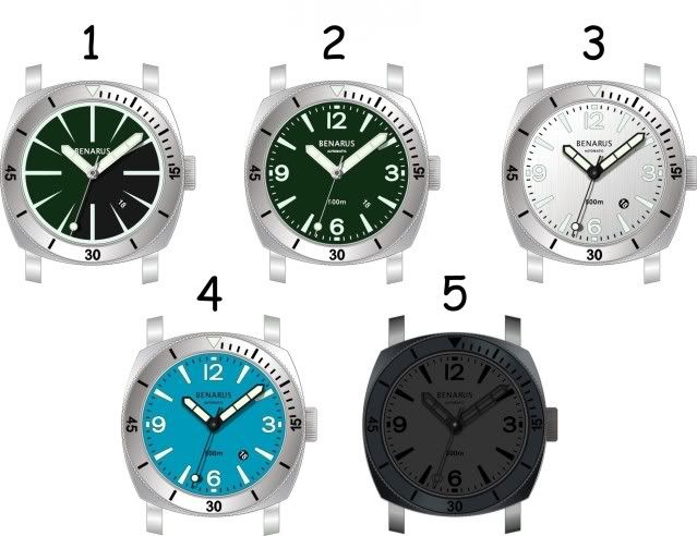 |
|||||||||
|
Rhino-Ranch Guest
|
THANK YOU RALF !!!! and STEVE LAUGHLIN and MORESNOWDAYS ('cause you helped as well with some earlier drawings) and everyone who participated in the poll... this is going to ROCK ! Ralf, as soon as you get things sorted out, I will place my second pre-order. currently pre-ordered dial no. 4. Really very cool to be part of the process.Jim |
|||||||||
|
maroon03 3T WIS
|
steve great artwork on the case back if it goes anywhere it should be there and the dark green dial is not to shabby either i dont retract my earlier statements but i think that i can see where it fits in now and it only allows for a run of 50 on everything and thats pretty cool and the actual moray case from the other thread is awesome, it really catches the vintage diver look and the darker green does keep that feel. |
|||||||||
|
Steve Laughlin 3T WIS
|
Thanks everyone. I admit I was opposed to messing with the design in any way, and I want to thank Montauk and moresnowdays for pushing the issue. You guys went out on a limb and took plenty of criticism from me, but you did push me to put the time into the design. Thank you for doing that, this is the result of your efforts. Steve |
|||||||||
|
moresnowdays 3T WIS
|
Thanks all, this is a great place to share ideas and it looks like the results are fantastic!!! |
|||||||||
|
Rhino-Ranch Guest
|
It was just fun and rewarding to be part of the process. Everyone pulled together in the end, and that's what counts. This is going to be a very special watch, that I will certainly treasure, and never part with. Jim |
|||||||||
|
suitekids 3T WIS
|
I'm in for a green with logo |
|||||||||
|
AntFarm 3T WIS 
|
That is just an awesome caseback Steve. great work you're bery talented...hand6.gif |
|||||||||
|
Skipdawg 3T WIS 
|
Steve agree with the others one very KEWL caseback. :cool: hand6.gifhand6.gif |
|||||||||
|
suitekids 3T WIS
|
I'm reserving mine, #2 Dark Green Dial, Eel logo caseback, polished hour,orange minute, polished orange tip sweep???Brushed case. Has anyone given thought to the green dial in the carbonfiber format, that would be to nice of a touch again. It was what lured me in the beginning, was the blue carbon dial from the 'cuda. Not trying to make things complicated, just another suggestion before production runs. |
|||||||||
|
BENARUS 3T WIS
|
The BRG Moray case back drawing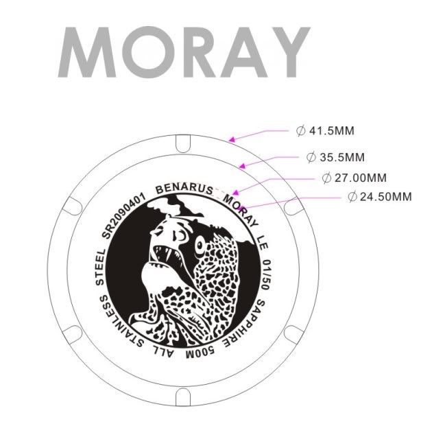 I think a Carbon green does not match this vintage style but could be nice in another case |
|||||||||
|
Rhino-Ranch Guest
|
Ralf -- Please reserve me MORAY Limited Edition w/ Eel logo case back. If you decide to offer the Eel logo case back on the other Moray watches, then please include on my pre-order dial no. 4 seafoam. This is very cool, and exciting to have been part of the design process. And, again, thanks to you and Steve Laughlin and others who have supported this !!! Jim |
|||||||||
|
pallet spoon Guest
|
I agree with Ralf in this case ... a carbon fiber dail would be too high-tech for this design. It would be nice on another watch tho, and I hope Ralf keeps it in mind for one of his more modern designs ;) . Since Ralf outlines all his numerals in black generally a Silver Carbon (texalium) dial would look sweet too. |
|||||||||